Top 4 Visual Must Haves in Digital Menu Board Design
We can’t all have an artistic eye. But unlike Kiwi Menu Boards, many menu board companies lack both creative AND strategic sensibilities, and many businesses end up settling for a mediocre menu board that they begin to resent over time as an ineffective eye sore. Your menu board is more than a visual list of your products; your menu board is your “best face forward,” engaging customers, helping with customer flow, showcasing your style, and maximizing your profits.
If you are unsure whether your current menu board is really working for you, don’t worry. Our team can provide you with a comprehensive free concept layout that synthesizes all three aspects of a stellar menu board product: style, strategy, and maximizing profits.
You may need to ditch your old menu board for a new Kiwi Menu Board if…


- your menu board’s style is dated and unappealing.
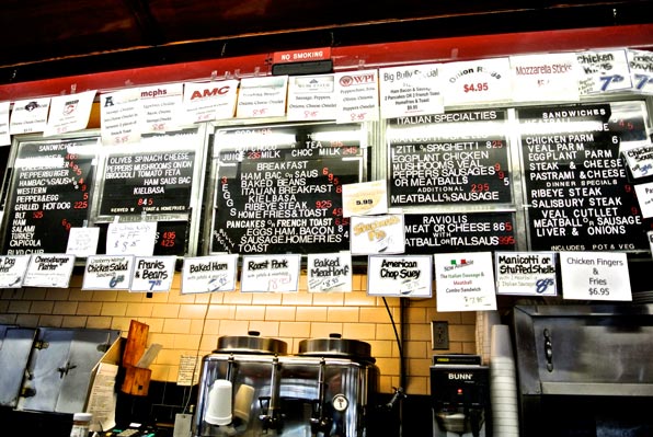
- your menu board is difficult to read or illegible.
- your customers struggle to understand the products available or have difficulty ordering.
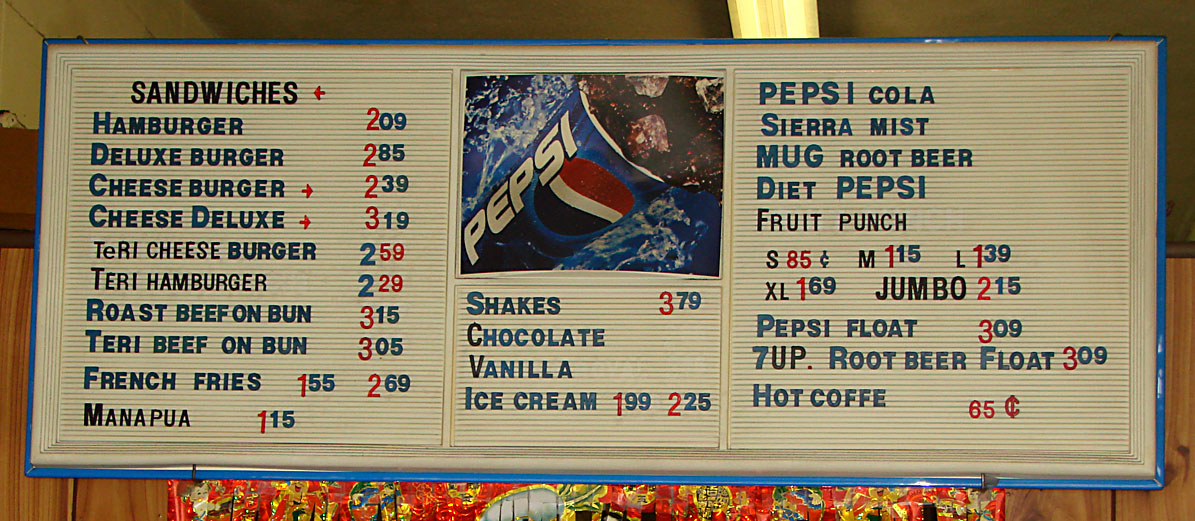
- your menu board is faded, damaged, or is a mess of random strips.
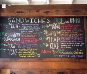
- your chalkboard is a lot of upkeep or looks untidy.


Leave A Comment